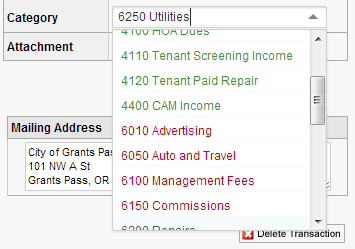
 With the major system update a couple weeks back, one of the visual items we lost was the colored categories (ie: Income categories were green, expense categories red) when posting or editing transactions. We hadn’t realized how helpful those colors were and when they went away with the updates our customer service reps heard about it. So good news, the colorized categories are back!!
We reported earlier that there was still some display issues on drop-down options on the new forms with Internet Explorer. Those issues are now resolved. Unfortunately, Internet Explorer doesn’t follow the same strict standards of other popular browsers (Chrome and Firefox) so it was a bit of work to program some work-arounds specific to IE. We think we got to the bottom of it though and the new forms are working well for all browsers.
In addition, we finished the roll-out of the new buttons on the reports panel. The same new styled buttons you saw show up a couple weeks ago on the new ledgers now flow through into the reports for a synchronized look and feel across the application.


