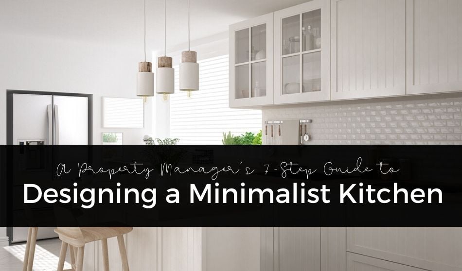
Up and coming renters have made it clear what they love — simplicity and functionality. Minimalism brings these principles together in a sleek and trendy way to appeal to those that are happier with less. They want a place where it’s easy to unwind and hide from the stresses of the outside world. With our seven-step guide to designing a minimalist kitchen, you can bring this design style to life.
Read on to learn how to make your property a frontrunner on anyone’s rental list.
1. Color
The right color palette is essential to a clean-looking design. The first thing you need to do is choose the colors you want to use in your kitchen. Stick to a maximum of three. You need one base color and a couple of accent colors to tie the kitchen together. White is the most classic base color for a minimalist style. Your accent colors must complement each other without overwhelming the senses. Stick to neutral colors that bring in a hint of visual interest — tans, beiges, and greys are your best bet. The colors you choose will help determine the materials and decorations you incorporate into the space.
2. Layout
Freshen up the layout of any kitchen by knocking down some walls if necessary. Removing a wall or two creates a better sense of flow with the rest of the home. It makes the kitchen look bigger and keeps it from feeling cut-off from other important areas. If the walls surrounding the kitchen are load-bearing, consider knocking out a window or bar space instead.
As far as placement for counters and appliances go, an L, U, or G layout are your best options for a minimal design. Prioritize counter space above everything during the design phase.
3. Hidden Spaces
Clear counter spaces, clean colors, and crisp lines are all essential to your minimalist design. But they aren’t the only things that you have to consider with a room as important as the kitchen. The invisible parts of the kitchen need to be incredibly functional for your design to truly work.
The insides of cabinets, the refrigerator, and the pantry must all provide plenty of storage to cut back on the amount of stuff left sitting out. Anywhere you can incorporate storage, you should. Make sure these areas are easy to keep clean as well.
4. Lighting
The nice thing about minimalist design is that it doesn’t have to be expensive. For example, you don’t have to spend a lot of money on elaborate fixtures. But, the lighting you do buy should lend itself to the overall “mood” of the space. Pick lights that incorporate the simplest shapes. Anything too busy will throw off the design and look completely out of place.
Each light should serve a purpose. Overhead lighting is good because it illuminates the entire kitchen. Make it bright to really show off the space. Sometimes, a single light is all you need. Task lighting is another way to brighten up the places that need it. A warm pendant light above the dining area or bar can do wonders for the ambiance of a room. Obviously, windows are always nice. They help to open up any room and are a great opportunity to add ambient light from outside.
But don’t fret if you’re short on natural light. You can add sleek wall fixtures that bring in extra lighting without being too cumbersome.
5. Flooring
Wood or faux-wood flooring is the perfect material for any minimalist design. Not only is wood a lot less expensive than it once was, but it’s also an absolute classic. It melds well with so many styles, making it less likely you will need to redo the floors in the near future.
The only catch to real wood is that it’s easily damaged by water. And as we all know, the kitchen is ground zero for spills, plumbing issues, and other accidents. You’ll have to weigh the risk of replacing damaged wood with its timeless style. If you decide that the risk isn’t worth your time, here are a few other flooring materials you might consider:
Concrete
Another amazing option for minimalist design, concrete brings a sleek look to any room.
However, it’s only realistic for ground-level units. Concrete provides a unique look but is notoriously difficult to install on any level of a building other than the first.
Tile and Stone
Tile is a popular choice for kitchen floors and can easily be implemented into a minimalist design. However, it’s incredibly hard to replace when it cracks. And the installation process is a pain, too. If you’d prefer something with an organic aesthetic, natural stone is a beautiful flooring option. With the type of rock, you can really tie your whole design together. The drawback to natural stone is its upfront cost. It isn’t the most affordable material at the start, but it is the least likely to get damaged over time. As long as you care for them, your stone-tiled floors could literally last you a lifetime.
The main issue, however, is the lack of noise absorption. And in a rental property, that can be a real problem.
6. Minimalist Visual Interest
Just because you are keeping it minimal doesn’t mean your kitchen has to be boring. You can still incorporate some visual interest into the space. There needs to be something for a renter’s eye to land on that will give them that oh wow feeling. Interesting elements can be the smallest things — from the curve of the sink faucet to your choice of lighting.
Textures are a fantastic way to add depth to your kitchen design. For example, you can add interest by incorporating a brick or tile backsplash to contrast the smooth surfaces of counters. It’s easy for something small to make a huge difference when it comes to minimalism.
7. Appliances
The refrigerator, oven, sink, and dishwasher are essentials in any kitchen. At the same time, however, they can easily overwhelm your carefully put together design. Stainless steel appliances fit well into a minimalist kitchen. They meld with the neutral color palette, unlike darker choices that might overwhelm the senses. It’s also worth the effort to fit appliances into the design, so they fall flush with other surfaces. If your refrigerator or stovetop is sticking out from the counter, it disrupts the clean lines you’ve worked so hard on. Keep it sharp so the eye can glide along surfaces without interruption.
You wouldn’t imagine minimalism takes so much thought, huh? Now that you know the ins and outs of designing a minimalist kitchen, you can start bringing a fresh new look into your property.
Your future tenants are going to be very impressed!


Very nice guide here, thank you for putting all the tips together! Enjoyed reading it and i think that most important step for me is picking the right colour and layout! It doesn’t matter how beautiful your tiles are or if lightning is bright enough (because if it isn’t – it’s easily fixable), because if it looks dull or has an unpleasant colour palette that burns your eye, or uncomfortable to operate and navigate in – everything else just doesn’t matter! I’d strongy agree on picking something neutral like white for your main colour and mixing it with something interesting but not oversaturated to created a nice Colour scheme!Colour scheme are, according to Wiki: “Color schemes are used to create style and appeal. Colors that create an aesthetic feeling when used together will commonly accompany each other in color schemes. A basic color scheme will use two colors that look appealing together.” Here’s a link to help you with navigation: https://en.wikipedia.org/wiki/Color_scheme Thanks and enjoy your time decorating!
Thanks for your feedback, kind words, and suggestions.